Investor Opportunities
Marcus & Millichap is the top commercial real estate investment firm in North America, with a vast property inventory available online. After the redesign of MarcusMillichap.com, overall traffic increased, but property searches and online conversions remained stagnant. With such a strong database at hand, the challenge became clear: How could we better leverage this inventory to connect with more buyers and drive action?

Studio Session
To explore solutions, I organized a Studio Session with a cross-functional team. Using personas developed in an earlier exercise, we ran a SWOT-style brainstorming session with sticky notes to weigh pros and cons of potential features. We prioritized the most impactful ideas and set aside those with limited value.
The session drew participation from multiple departments—even legal—whose insights helped us account for real estate’s regulatory nuances. This diverse collaboration grounded our discussions and made the resulting concepts both practical and innovative.
Marketing was tasked with advising agents to educate their clients about property search capabilities, focusing on culture change and enabling more informed conversations between clients and agents. Meanwhile, the Product team was tasked with expanding property search functionalities through a dedicated app—the focus of this case study. The activities outlined below detail how our team developed this concept from ideation to execution, while maintaining a human-centered design approach throughout the process.
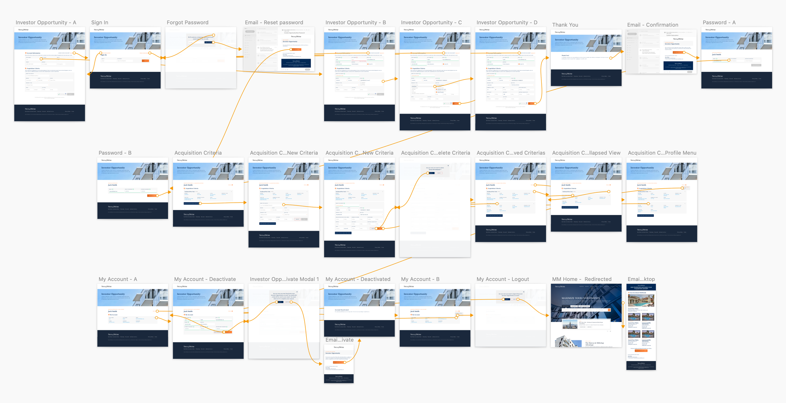
User flow
Building on the workshop’s output, I created a detailed user flow to define the proposed experience. After several iterations, the flow emphasized key touchpoints where Marcus & Millichap could build meaningful engagement with clients. The ultimate goal was not just to display listings, but to spark conversations and relationships with potential investors. The diagram highlights three core moments where these dialogues are facilitated.
Ideation & Sketching
With the flow validated, I began sketching early wireframes on paper, then gathered feedback from fellow designers to refine interactions and patterns. Once aligned, I moved into Figma, building digital wireframes with real copy, imagery, and interface elements. This step revealed how the designs would perform in a more realistic context and allowed further fine-tuning.


User Testing
I tested the first clickable prototype with three property investors in moderated sessions. After a short introduction, I encouraged them to explore freely while I asked open-ended questions. Their feedback uncovered both direct insights and subtle cues. For example, one participant repeatedly leaned in toward the screen—signaling that the font size was too small and readability was compromised. These observations informed key updates to the design.

Once approved, I partnered closely with developers to ensure the product matched the design system and delivered the intended interactions. As expected, fidelity between design and development required careful iteration, but we achieved a strong balance between aesthetics and functionality.
We soft-launched with a select client group and gathered feedback. Most issues were technical and are being resolved, while requests like instant property alerts post-registration were noted for future versions (though business priorities required us to keep the weekly “radar” feature for launch).

Acquisition Criteria page before talking to users.
1. Retouched and repositioned header image to improve legibility.
2. Reduced the number of mandatory fields.

Acquisition Criteria page after talking to users.
3. Increased font size on titles and body.
4. Added breadcrumb to help users locate themselves.
5. Added collapse/expand menu to improve usability.
6. Organized groups of information by adding a grey background.
7. Added more optional fields for a more precise search.
Implementation
Once approved, I partnered closely with developers to ensure the product matched the design system and delivered the intended interactions. As expected, fidelity between design and development required careful iteration, but we achieved a strong balance between aesthetics and functionality.
We soft-launched with a select client group and gathered feedback. Most issues were technical and are being resolved, while requests like instant property alerts post-registration were noted for future versions (though business priorities required us to keep the weekly “radar” feature for launch).


Future Recommendations
This project highlighted the importance of involving users at every stage. While time and resources required us to work within a lean, assumption-based approach, we successfully integrated user input where possible and fostered collaboration across teams.
For future iterations, I recommend pairing quantitative research (to track conversions and usage patterns) with qualitative feedback (to capture investor expectations and behaviors). This will allow the product to evolve into a more user-centered and business-driven solution.