Investor Opportunities
📎 UX, UI, Product ⏱ 7 min read
Overview
Marcus & Millichap is the number one commercial real estate investment firm in North America with a large property inventory that can be accessed by anyone through their website. Despite the increased overall traffic with the redesign of MarcusMillichap.com, the property search average use and conversion rate generated from online businesses did not change significantly. With a great property inventory database available and the wish to reach as many buyers as possible, we asked ourselves:
How can we make the best use of our property inventory database?
Studio Session
A cross-functional group of coworkers got together on a Studio Session to brainstorm ideas to answer the above-stated question. Taking into consideration our personas (descendant from a previous group exercise) we performed a SWOT-like analysis with sticky notes to evaluate each idea’s pros and cons. We generated several and organized them from the most feasible to the least. Ideas that were at the bottom were discarded while ideas on the top were kept for further discussion.
The session was represented by employees from different areas. Marketing and Product were surprised that even someone from the legal department decided to attend the workshop and was able to collaborate extensively, making the discussion more down-to-earth. Real Estate has a lot of bureaucratic aspects that we couldn’t anticipate as designers. The following chart summarizes the workshop highlights:
Marketing was tasked with ‘A) Advise agents to educate their clients about property search capabilities’. Marketing focused on culture change and created actions that facilitated driven conversations between clients and agents. Product was tasked with “B) Expand property search functionalities through a dedicated App.” which is the focus of this case study. The following activities were conducted within the Product team and reflect how we developed this idea through its execution while maintaining a human-centered design process.
Product & Feature Brainstorm
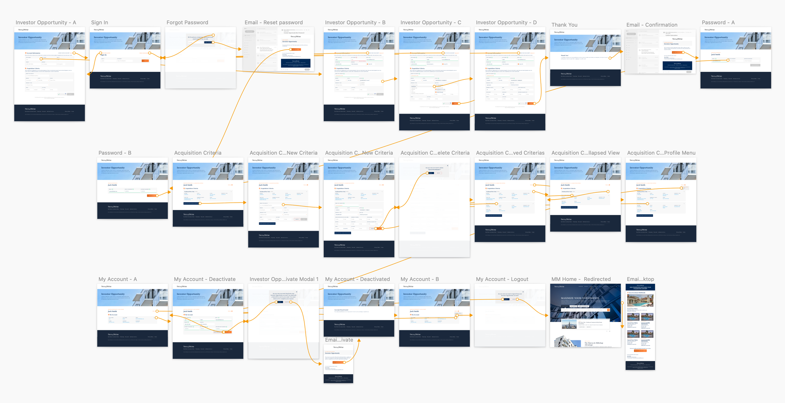
User flow
With the Product & Feature Brainstorm in mind, I started sketching a user-flow detailing all our intentions. After iterating and solving loose ends, I visually reinforced the touchpoints between Marcus & Millichap and its clients. At the end of the day, this project's goal was to start dialogues with our potential clients. The diagram below describes the three moments when the system facilitates these dialogues (green circles).
Ideation & Sketching
At this point, I already had enough information to start thinking in terms of wireframes. I normally start with pencil and paper and gather feedback from designers around me to validate patterns and interactions or revise them if someone has another point of view. After iterating it, I jumped into the Figma to see how my wireframes behaved as I populated them with real words, phrases, images, and buttons.


User Testing
After finishing version one of the clickable prototype, I conducted a qualitative moderated interview with three property investors. I explained what Investor Opportunities was and told them to explore the screens while I asked them open-ended questions. Here are a few observations that were later used to justify feature updates:

Indirect observations are critical during a feedback session because people often neglect thoughts and say things they don’t necessarily mean. Conversely, body language never lies. As I observed one of my interviewees, I’ve noticed he was often getting close to the screen. I’ve realized the font size I chose was too small for him, harming the legibility.
Aware of the business and project goals, I tried to incorporate the feedback pieces into the project as much as I could. However, some user’s suggestions were dismissed due to corporate decisions. One example was the “radar-like” feature, which sends emails with new properties that match the client’s criteria every week. Users mentioned they want to see these properties immediately after finishing their registration, but unfortunately, business sponsors decided to vet that and proceed with their original radar idea. All the dismissed user feedback was documented for future reference.

Acquisition Criteria page before talking to users.
1. Retouched and repositioned header image to improve legibility.
2. Reduced the number of mandatory fields.

Acquisition Criteria page after talking to users.
3. Increased font size on titles and body.
4. Added breadcrumb to help users locate themselves.
5. Added collapse/expand menu to improve usability.
6. Organized groups of information by adding a grey background.
7. Added more optional fields for a more precise search.
Implementation
Our managers signed off on the proposed flow, and I worked closely with the developers to ensure they followed the style guide. The implementation challenges were, as I expected, all related to mockup fidelity. After several weeks we were able to find workarounds and make sure the aesthetic and the interaction were just as good as expected.
The project was recently soft-launched with a selected sample of clients and friends. We received mixed feedback with most of the negative comments technical-related (these are currently being fixed as our team debugs the product). The next step is to test and improve the mobile experience, which is not fully developed, so we can prepare for the official launch.

Lessons & Future Recommendations
It would be beneficial if we could have consulted with users in every step of the project. Unfortunately, sometimes designers must adapt and work on a lean human-centered design approach. We had to deal with many hypotheses and make some assumptions. On the positive side, we were able to, on some degree, include users in the process. And internally, everyone co-created throughout the project: managers, designers, executives, and agents.
For future investigations, quantitative research would be recommended to analyze the product metrics and conversion rates and qualitative research to understand what users are thinking during and after interacting with the product. The next version would therefore be more humanized and could expanded functionalities and goals.